

What is the Pantone 2022 colour and how can we include it in the decoration of our home? Find out what Pantone has said this 2022, what the selected colour represents and much more information from Sanchis Hôme.
Pantone colour
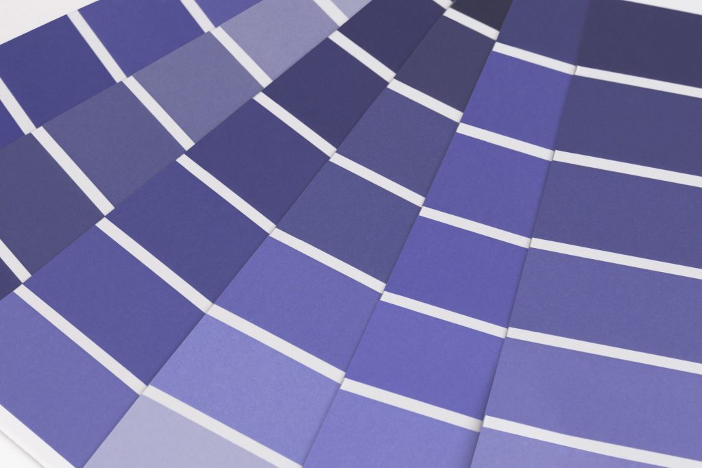
Once again this year, Pantone has made its pronouncement: the colour par excellence for 2022 is Veri Peri (Pantone 17-3938), a solid colour between purple and blue, with touches of red, which will set trends mainly in fashion, but also in design, art, decoration…
What the colour Veri Peri represents
It is a bold, lively colour that represents transformation, both in the digital world and in the physical world. A cheerful and dynamic colour, full of possibilities.
What colours combine with Veri Peri and how to use it in the decoration of our home is what we want to tell you in this new article by Sanchis Hôme.
Matching colours for Pantone 2022
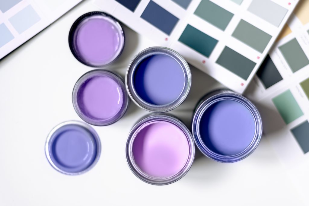
The colour Veri Peri is very versatile and can be combined with many colours. But not all of these combinations are suitable for decoration and interior design. Many environments require subtle and not too explosive colour mixtures so as not to evoke exaltation. That is why at Sanchis Hôme we prefer to combine this colour with light tones such as white or beige, although if you are looking for darker colours you can go for chocolate brown.
How to use it in decoration
When it comes to interior design, Veri Peri, a shade somewhere between blue and purple, is a colour that can go out of fashion and therefore needs to be used wisely and cautiously, and it is difficult to find finishes in this shade. However, it is an ideal colour to add a splash of colour to any room.
Bath with purple
Neutral tones are the preferred tones for bathrooms. However, this doesn’t mean that you can’t make use of small purple touches to give the space more character. The trick is to use them very subtly, for example: on towels or soap dispensers.
Kitchen with purple
The same goes for kitchens as for bathrooms. The preferred colours are the more neutral ones as they give a contemporary and elegant look. So where could we put Pantone 2022? On the crockery! It’s an idea that we love. A colourful tableware where purples predominate.
Purple room
And where do we place the Veri Peri in the room? It can be placed on textiles such as sheets, cushions and even rugs. Certain touches of bluish purple will be soothing in a room, as it is a colour linked to spirituality.
Living room with purple
For the living room we also bet on cushions or even the upholstery of chairs, carpets… Although without a doubt, through objects such as vases and even through plants such as Lavender can be great ideas.
Pantone 2022 coloured floor coverings
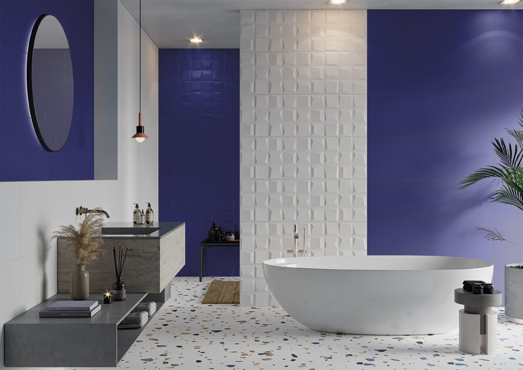
Sanchis Hôme’s Colours Collection combines pearlescent colours with original relief surfaces, including Navy, the colour that instils hope and fuels positive thinking.
What is the effect of colour on people?
For International Colour Day, we would also like to talk to you about some of the conclusions of recent studies and research, where it is determined that colours affect and influence people’s emotions, attitudes and decisions, although each colour in a different way.
What feelings and emotions does each colour generate?
- Happiness: green, blue and white.
- Creativity: yellow, blue, green and white.
- Productivity: blue, purple, yellow, grey and white.
- Inspiration: yellow, purple and white.
- Motivation: blue and white.
- Enthusiasm: orange, green, blue and white.
- Stress: grey.
Discover the different collections of Sanchis Hôme where the intensity of colour gets all the attention!